Karalty was a new premium accessories brand launching its first online store. I led the end-to-end product design of the e-commerce experience, defining site structure, shopping flows, and visual direction to create a culturally grounded, intuitive, and accessible shopping experience across desktop and mobile.
Karalty — E-commerce

My Role
I owned the end-to-end product design of Karalty’s e-commerce experience, from information architecture and user flows to product page design, navigation, and responsive implementation.

Tools Used
Wix
Figma
Canva / Adobe Photoshop
Accessibility checkers
The Challenge
Karalty needed an online store that communicated luxury and cultural identity while remaining intuitive for first-time shoppers. The challenge was to balance bold visual storytelling with clear, accessible shopping flows that guided users from discovery to purchase.
Sketch → Wireframe → Visual Design → Final Website
Sketch → Wireframe → Visual Design → Final Website
Sketch
Before creating digital wireframes, I sketched the initial homepage layout by hand to explore structure, hierarchy, and user flow. This early sketch helped establish a clear foundation for the homepage before moving into digital design.
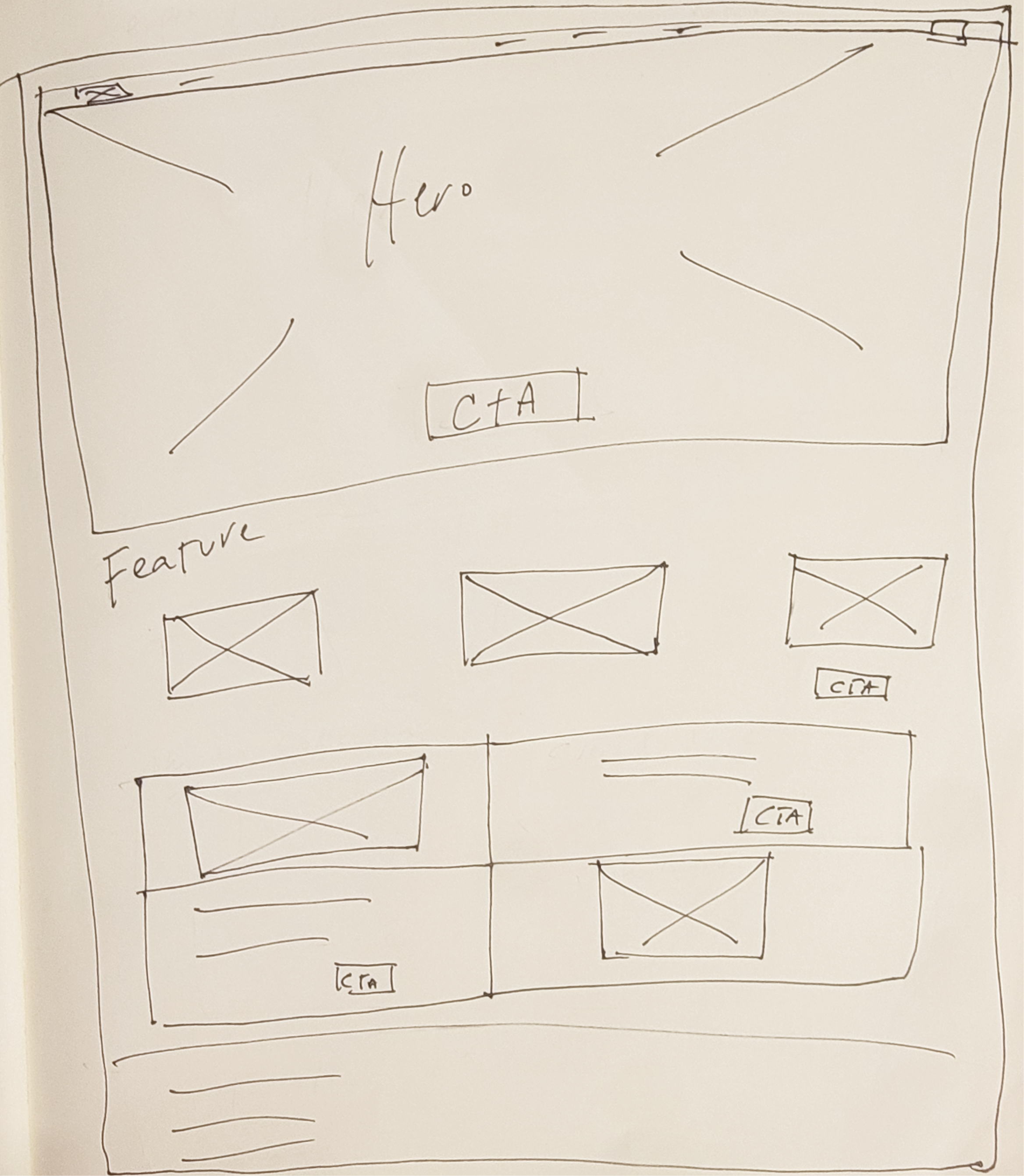
I began with hand-drawn sketches to define layout hierarchy and visual storytelling before moving into low-fidelity wireframes in Figma.
Wireframe (Low-Fidelity Prototype)
The low-fidelity wireframe established the homepage information hierarchy, visual balance, and primary user flow. I prioritized a linear scrolling experience so users could naturally discover collections without relying on complex navigation.
Key design decisions included:
Simplified navigation bar (Feature, Ankara, Rayon, Satin, About) for intuitive browsing.
.Clear CTAs (“Shop” and “View More”) positioned after each collection.
Visual storytelling with large imagery to highlight textures and fabrics.
These low-fidelity wireframes helped refine navigation, product layout, and content structure before visual design.
Customized with the brand colours and typography inspired by African royalty:
Gold for luxury and confidence.
Deep purple and navy for sophistication and heritage.
Clean sans-serif fonts for modern readability.
Final Website (High-Fidelity + Development)
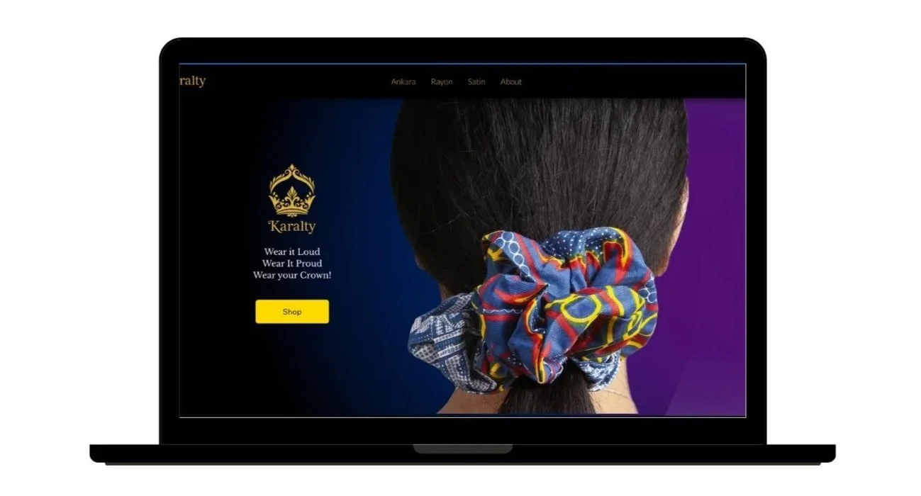
The final layout balanced bold imagery with structured content to prevent visual overload while keeping the brand luxurious.
Accessibility improvements:
High colour contrast for WCAG compliance.
Clear alt text for all product images
Logical heading structure for screen readers.
Accessible · Intuitive · Culturally Grounded
*
Accessible · Intuitive · Culturally Grounded *
A quick look at how the project began, from the first rough sketch to the wireframe and the final website design.
I began with hand-drawn sketches to define layout hierarchy and visual storytelling before translating ideas into low-fidelity wireframes in Figma.
These wireframes clarified navigation, product layout, and content structure, ensuring a strong foundation before moving into visual design.
This process led to a cohesive, accessible, and visually distinctive e-commerce experience.

Outcome
Karalty launched with a cohesive brand identity and a fully responsive e-commerce experience. Early feedback from the client and test users confirmed that the navigation felt intuitive, and the visual direction successfully communicated the brand's cultural identity and premium positioning. The design system established a clear visual hierarchy across desktop and mobile, with WCAG-compliant contrast throughout, ensuring the store was as accessible as it was visually distinctive.
Tools Used
Wix
Figma
Canva / Adobe Photoshop
Accessibility checkers